Monday, March 30, 2015

Visual Communication In Art and Design. ( DVI 2034)

Visual Communication.


Image 1

  •  Communication through a visual aid and is described as the conveyance of ideas and information in forms that can be read or looked upon.
  •  Trains designers for the communication needs of industry and society.
  •  Encourage innovative visual ideas that inform, interpret, instruct or persuade the intended user across the spectrum of application.

ELEMENTS OF DESIGN.

Line.
Is a mark between two points.Lines can be used for a wide range of purpose: stressing a word or phrase, connecting content to one another, creating pattern and much more.

Image 1.

Color.
Is used to generate emotions, define importance, create visual interest and more. CYMK is a subtractive color; RGB is additive color.

Image 1.2
Texture.
 Relates the to surface of an object; the look of feel of it. Concrete has a rough texture; drywall has a smooth and subtle texture. Using texture in design is a great way to add depth and visual interest.

Image 1.3
Size.
Is how small of large something is; a small shirt vs an extra large shirt. Use size to define importance, create visual interest in a design.

Image 1.4
Space.
Is the area around or between element in a design. It can be used to separate or group information; lead the eye through a design and more.

Image 1.5
Value.
Is how light or how dark an area looks. A gradient, shown above, is a great way to visualize value - everything from dark to white, all the shade in-between, has a value.

Image 1.5

PRINCIPLES of DESIGN.

Contrast.
 Unique elements in a design should stand apart from one another. one way to do this is to use contrast. Good contrast in design - which can be achieved using elements like color, tone, size and more.

Image 1.6

Alignment.

Proper alignment in a design means that every element in it is visually connected to another element.

Image 1.7

Proximity.

Allows for visual unity in a design. If two elements are related to each other, they should be placed in close proximity to one another.

Image 1.8

Repetition.

 Breeds cohesiveness in a design. Establish a style for each element in a design and use it on similar elements.

Image 1.9


Tuesday, March 10, 2015

CRITICAL STUDY in ART and DESIGN. (DCC 2084)

Visual form.

Icon: A small picture or symbol on a computer screen that represents a programs.
               A person or a thing that is considered to be a symbol of something.
               A sign which has a characteristic in common with the thing it signifies.

Image 1.

Image 1.1.


Symbol: A sign, object, etc which represents something function or process.
                      A  shape or sign used to represent something such as an organization.
                      A  thing that represents or stands for something else, especially a material object                       representing something abstract.

Image 1.2
Image 1.3

Index: A way to showing how the price, value, rate, etc or something change.
                   A sign of measure of something.
                   A a figure in a system or scale representing the average value of specified prices,                        shares, or other items as compared with some reference figure.

Image 1.4

Metaphor: A something used, or regarded as being used, to represent something else;                                  emblem; symbol.
                           A figure of speech in which a word or phrase is applied to an object or and                                  action that it does.

Image 1.5


Image 1.6


Wednesday, March 4, 2015

CRITICAL STUDY in ART and DESIGN (DCC 2084)

Understanding Principles of design.

    
   The principles of design are the recipe for a good work of art. The principles combine the elements to create an aesthetic placement of things that will produce a good design.

  • Pattern
  • Emphasis
  • Variety
  • Unity
  • Balance
  • Rhythm&Movement
  • Proportion
Pattern

 Repetition of the element of art.

Image 1.

Emphasis.

Focus - Main idea what "grabs" your attention.

Image 1.1
Variety.

An assortment of lines, shapes, colors, and other elements of art in art work looks complete.

Image 1.2
Unity.

How element work together, fit together, so the art works look completed.

Image 1.3
Balance. 
(symmetrical)

Same design on both sides of a mid line.

Image 1.4

(asymmetrical)

A balance that is not even.

Image 1.5
(radial).

 Type of balance based on a circle with its  design extending from center.

Image 1.6
Rhythm&Movement.

A regular repetition of the element  of art  to create a sense  of rhythm  and movement.

Image 1.7
Proportion.

How parts fit together to make a whole - Size relations
(includes scale, monumental, miniature, exaggeration).

Image 1.8


CRITICAL STUDY (DCC 2084)

 Understanding Element of Design.

   Elements are components or parts which can be isolated and defined in any visual design or work of art and carry a wide variety of massages.

The Element are:
  • Line
  • Shape
  • Color
  • Texture
  • Value
  • Size
  • Space
Line.
 
Image 1.
    An outline, it can create texture and can be thick and thin. Line can include actual, implied, vertical, horizontal, diagonal and contour lines.


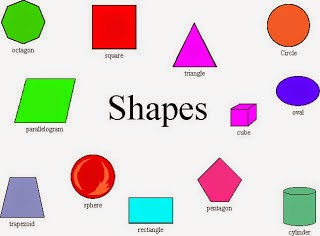
Shape.


Image 1.1
    A 2-dimensional line with no form or thickness. Shapes are flat and can be grouped into two categories, geometric and organic.


Color.
Image 1.2
   The color wheel is a way of showing the chromatic scale in a circle using all the colors made with the primary triad. Complimentary pairs can produce dull and neutral color.  Black and white can be added to produce tints (add white), shades (add black) and tones (add gray).

Texture.
Image 1.3
    Texture can be real or implied by different uses of media. It is the degree of roughness or smoothness in objects.


Value.
Image 1.4
      It is the contrast between black and white and all the tones in between its also, value can be used with color as well as black and white. Contrast is the extreme changes between values.


Size.
Image 1.5
   3-dimensional object having volume and thickness. 3-D effect that can be implied with the use of light and shading techniques. Form can be viewed from many angles.


Space.
Image 1.6
    Refers to variations in the perspective, and proportions of objects, lines or shapes. There is a variation of sizes in space of objects either real or imagined.

Sunday, December 28, 2014

Copywriting for Advertising ( Radio ads)

Weekly Task.

Need to find two radio ads. with their script.


Honda Civic Hatchback Radio ads.

Image 1.


Duration 0.42 sec.

Target audience: Younger driver group, and group of person age about 30 to 40 years old.

https://www.youtube.com/watch?v=Gq1-t2dWOcU

Script.
  
   Yes Sir or Madam, if your friends it’s just brought a new Hatch that’s strangely that not the Honda Civic here something you might not want to mention,…
Don’t tell him, that the Honda Civic has been awarded the best hot hatch money can buy.
Don’t tell him, the Honda Civic has been awarded the car most worth selling on money on twice.
Don’t tell him, that the leading international studies show  that Honda are the most reliable  car on the roads, and at least 70% more reliable that what ever his bought and really..
Don’t tell him, that he could has bought a new Honda Civic Hatch for just two hundred and fourteen eight  thousand three hundred grand, its will just ruin your friendship.
Discover what so many already have.

HONDA THE POWER OF DREAM.
SFX 0.03 sec.


VICO CHOCOLATE DRINK RADIO ADS.

Image 1.1

Vico radio ads.

Duration : 0.32 sec.

Target audience: young kids.

https://www.youtube.com/watch?v=LcuTeTdrps0

Script.

 Kami suka.. Ka.. kalazatan coco jom minum Vico..
Kami suka.. Ka.. kalazatan coco jom minum Vico..
Gud gud di sini gud gud di sana GOOD sini GOOD sana semuanya GOOD GOOD,GOOD ,GOOD, GOOD, GOOD, GOOD.. AAAHHH..
Emm bestnya minum vico GOOD, GOOD, GOOD, GOOD, GOOD.
Minumlah Vico lebih vitamin, lebih mineral lebih coco dan lebih kelazatan GOOD, GOOD, GOOD, GOOD, GOOD, dalam setiap tegukkan.
V. I. C. O.   VICO…

SFX duration: 0.01 sec – 0.31 sec

Copywriting for Advertising. (Good Ads & Bad Ads)

Weekly Task.

Task 2.

Our lecturer, wanted us find two printed ads. One good printed ads and another one bad printed ads.

Good ads.

Image 1.

This printed ads is about a campaign from NHS (National Health Service).
  individual systems:
 -National Health Service (England).
 -Health and Social Care in Northern Ireland.
 -NHS Scotland.
 -NHS Wales.
This NHS ads is aiming the addicted smoker to help them stop smoking and had a healthy live.


Bad Ads.


Image 1.1

This is a Dettol ads. The ads are bad because the background of the display copy are to disturbing and doesn't  make any sense with the Dettol hand wash soap.

Why must to kill people to get the bacteria.?
May brought a negative impact to young consumers.


Monday, December 22, 2014

Copywriting for Advertising (TV commercial)

TASK 5.

Find two emotional TV commercial and two direct selling TV commercial.


Emotional TV Commercial.

McDonald's Dad Driving Baby.
Duration: 1.05 sec.


Hari Raya TV commercial by BERNAS PADIBERAS NASIONAL BERHAD.
Duration: 7.42 sec.


Direct Selling TV Commercial.

Axe Deodorant TV commercial.
Target: for men ages 18-24.
Duration: 0.30 sec.


Oreo sandwich cookies TV commercial.
Target: beyond mom and children.
Duration: 0.30 sec.